python matplotlib axis 관련 포스팅
python 그래프 축 관련 세부 설정에 대해 아는 대로 포스팅 합니다.
해당 코드를 실습할수 있는 데이터는
캐글 데이터 페이지를 통해서 다운로드 부탁드리겠습니다.
#기본 설정 및 데이터 불러오기
import warnings
warnings.filterwarnings(action='ignore')

import matplotlib.pyplot as plt
import numpy as np
import pandas as pd

data = pd.read_csv("2019_kbo_for_kaggle_v2.csv")
#data = data[data.columns[27:]]
print(data.shape)
(1913, 37)
이전 포스팅과 동일하게 선수들의 기록에 연차를 부여하고
이 연차들을 그룹화 하여, 연차별 차기 시즌 OPS의 평균, 표준편차를 구하였습니다.
data = data.sort_values(by=['batter_name', 'year'])  # 이름과 연도 별로 sort

# 각 관측치마다 연차를 부여하기 위해서 생성
batter_name_first = [i for i in data['batter_name'][1:]]
batter_name_zero = [i for i in data['batter_name'][0:]]

work_year = list()  # 해당 관측치와 다음 관측치의 이름이 같으면 1년차 -> 2년차의 방식을 빠르게 수행하기 위해서 시행
work_year.append(1)

for i in range(len(batter_name_first)):
    if batter_name_first[i] == batter_name_zero[i]:
        work_year.append(work_year[i]+1)
    else:
        work_year.append(1)

data['work_year'] = work_year

work_group_total = data.groupby(['work_year'])['YOPS'].aggregate(['mean', 'std', 'count']).reset_index()
one_to_nineteen = list(work_group_total['work_year'])
work_group_total.tail(3)
| work_year | mean | std | count | |
|---|---|---|---|---|
| 16 | 17 | 0.734583 | 0.093955 | 12 |
| 17 | 18 | 0.689000 | 0.165181 | 8 |
| 18 | 19 | 0.702333 | 0.214219 | 6 |
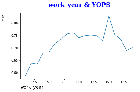
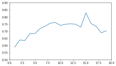
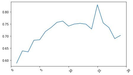
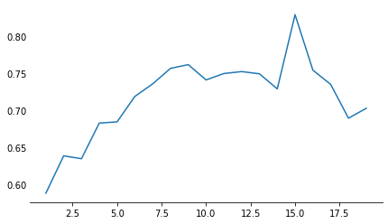
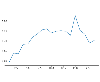
먼저 축과 제목 이름 설정 방법입니다.
x, y label, title을 통해 설정 가능하며,
font의 경우, dictionary로 사전 저장한 설정들을
fontdict에 넣어서 설정 변경이 가능합니다.
fig, ax = plt.subplots(figsize=(7,4))

plt.plot(one_to_nineteen, work_group_total['mean'])
plt.xlabel('work_year', fontsize=15, loc='left')
plt.ylabel('YOPS', labelpad=20, size=10, loc='top')

font_dict={'family': 'serif', 'color': 'b', 'weight': 'bold', 'size': 20}
plt.title('work_year & YOPS', pad=20, fontdict = font_dict); #pad = 그림과 텍스트의 간격
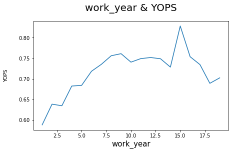
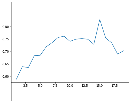
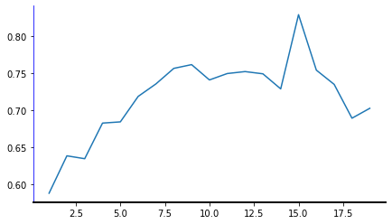
subplots에 객체 지정을 하고 쓰는 경우,
set_을 추가로 붙여서 동일하게 사용하면 됩니다.
fig, ax = plt.subplots(figsize=(7,4))

plt.plot(one_to_nineteen, work_group_total['mean'])
ax.set_xlabel('work_year', size=15)
ax.set_ylabel('YOPS', labelpad=20, size=10)
ax.set_title('work_year & YOPS', pad=20, fontsize=20); #pad = 그림과 텍스트의 간격
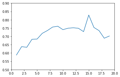
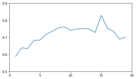
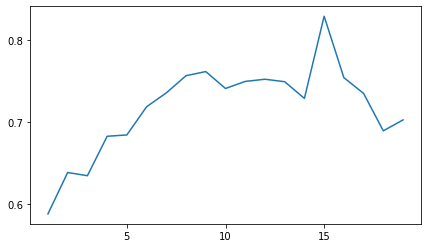
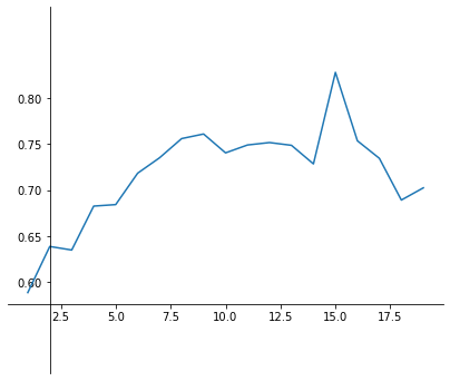
그 다음은 x축, y축 범위 지정입니다.
plt.axis를 활용하면
x축 범위의 최소, 최대 / y축 범위 최소, 최대를 입력해서 설정이 가능합니다.
plt.plot(one_to_nineteen, work_group_total['mean'])
plt.axis([0, 20, 0.5, 0.9]); #x축 범위 / y축 범위
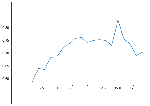
subplots를 활용해서 설정해도 동일하게 axis를 사용합니다.
fig, ax = plt.subplots(figsize=(7,4))
ax.plot(one_to_nineteen, work_group_total['mean'])
ax.axis([0, 20, 0.5, 0.9]); #x축 범위 / y축 범위

각자 따로 지정 하고 싶은 경우,
xlim, ylim을 활용하면 됩니다.
plt.plot(one_to_nineteen, work_group_total['mean'])
plt.xlim(0, 20, labelsize=15) #축 범위 설정
plt.ylim(0.5, 0.9);

subplots를 통해 지정하면 set_을 추가하면 됩니다.
fig, ax = plt.subplots(figsize=(7,4))
ax.plot(one_to_nineteen, work_group_total['mean'])
ax.set_xlim(0, 20) #축 범위 설정
ax.set_ylim(0.5, 0.9);
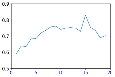
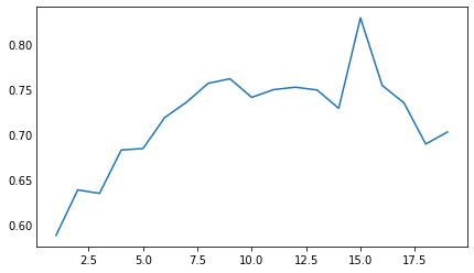
그 다음으로는 눈금 간격을 설정하는 방법입니다.
x,y ticks를 통해 지정이 가능하며,
size 지정 및 색깔 변경 등 다양하게 가능합니다
plt.plot(one_to_nineteen, work_group_total['mean'])
plt.xticks(np.arange(0, 25, 5), fontsize=15, color='b') #눈금 간격 설정
plt.yticks(np.arange(0.5, 1, 0.1), size=15);
subplots를 통해서 하는 경우라면
set_을 추가해서 설정을 하면 됩니다.
fig, ax = plt.subplots(figsize=(7,4))
ax.plot(one_to_nineteen, work_group_total['mean'])
ax.set_xticks(np.arange(0, 25, 5)) #눈금 간격 설정
ax.set_yticks(np.arange(0.5, 1, 0.1));
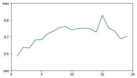
추가적으로, subplots에서는
먼저 축의 이름을 설정하고, 동일하게 set_ticks를 통해서 눈금 설정이 가능합니다.
그리고 set_ticklabels (축 지정을 먼저 하지 않는 경우라면 set_yticklabels)를 통해
각 눈금의 라벨을 변경하는 것이 가능합니다.
fig, ax = plt.subplots(figsize=(7,4))
ax.plot(one_to_nineteen, work_group_total['mean'])
ax.xaxis.set_ticks(np.arange(0, 25, 5)) #축 범위 설정
ax.yaxis.set_ticks(np.arange(0.5, 1, 0.1))
ax.yaxis.set_ticklabels(["min", 0.6, 0.7, 0.8, "max"]);
xlabels = np.arange(0, 25, 5)

fig, ax = plt.subplots(figsize=(7,4))
ax.plot(one_to_nineteen, work_group_total['mean'])
ax.set_xticks(xlabels) #축 범위 설정
ax.set_xticklabels(xlabels.astype('int'), rotation=45,
                   horizontalalignment='left'); #x축 라벨별 설정
범위 지정 없이 간단하게 눈금 간격만 지정하고 싶은 경우라면
아래의 방법을 사용하면 된다.
데이터 범위와 설정된 주 눈금 간격에 맞춰서 자동으로 그래프를 세팅해준다.
from matplotlib.ticker import MultipleLocator

fig, ax = plt.subplots(figsize=(7,4))
ax.yaxis.set_major_locator(MultipleLocator(0.1))
ax.xaxis.set_major_locator(MultipleLocator(5))
ax.plot(one_to_nineteen, work_group_total['mean']);
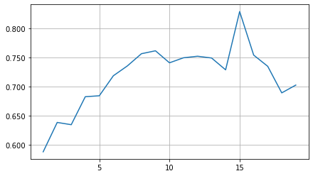
나오는 포멧의 변경이 필요하면 formatter를 통해
나오는 소수점 변경 등도 가능하다
fig, ax = plt.subplots(figsize=(7,4))
plt.grid(True)
ax.yaxis.set_major_formatter('{x:0.3f}')
ax.xaxis.set_major_locator(MultipleLocator(5))
ax.plot(one_to_nineteen, work_group_total['mean']);
다음으로는 x축, y축의 기본 설정을 바꾸는 방법이다.
먼저 축의 메인 눈금을 0으로 해서 안보이게 하는 방법이다.
fig, ax = plt.subplots(figsize=(7,4))
ax.tick_params(axis="y", length=0)
ax.plot(one_to_nineteen, work_group_total['mean']);
subplots를 통해, spines를 쓰게 되면
set_visible 옵션을 통해, 기본적으로 그려지는 선들을
안 보이게 할 수 있다.
fig, ax = plt.subplots(figsize=(7,4))
ax.spines["top"].set_visible(False)
ax.spines["left"].set_visible(False)
ax.spines["right"].set_visible(False)
ax.tick_params(axis="y", length=0)
ax.plot(one_to_nineteen, work_group_total['mean']);
set_bounds 옵션을 쓰게 되면
원하는 범위 만큼 선을 자유롭게 그릴 수 있게 된다.
fig, ax = plt.subplots(figsize=(7,4))
ax.spines["top"].set_visible(False)
ax.spines["left"].set_bounds(0.5, 0.9)
ax.spines["right"].set_visible(False)
ax.plot(one_to_nineteen, work_group_total['mean']);
set_position 옵션을 쓰게 되면
해당 설정에 따라 축의 위치를 자유롭게 바꿀수 있다.
data는 데이터의 값을 기준으로,
outward는 얼마나 벗어 날건지를
axes는 0 ~ 1 사이에서 얼마나 움직일 것인지를 지정해주면 된다.
fig, ax = plt.subplots(figsize=(7,4))
ax.spines["top"].set_visible(False)
ax.spines["left"].set_bounds(0.5, 0.9)
ax.spines["left"].set_position(("data", 2))
ax.spines["right"].set_visible(False)
ax.plot(one_to_nineteen, work_group_total['mean']);
fig, ax = plt.subplots(figsize=(7,4))
ax.spines["top"].set_visible(False)
ax.spines["left"].set_bounds(0.5, 0.9)
ax.spines["left"].set_position(("outward", 50))
ax.spines["right"].set_visible(False)
ax.plot(one_to_nineteen, work_group_total['mean']);
fig, ax = plt.subplots(figsize=(7,4))
ax.spines["top"].set_visible(False)
ax.spines["left"].set_bounds(0.5, 0.9)
ax.spines["left"].set_position(('axes', 0.045))
ax.spines["right"].set_visible(False)
ax.plot(one_to_nineteen, work_group_total['mean']);
추가적으로, 색깔 변경, 굵기 지정 등 다양하게 활용 가능하다
fig, ax = plt.subplots(figsize=(7,4))
ax.spines["top"].set_visible(False)
ax.spines["left"].set_color("b")
ax.spines["right"].set_visible(False)
ax.spines["bottom"].set_linewidth(2)
ax.plot(one_to_nineteen, work_group_total['mean']);
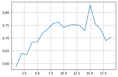
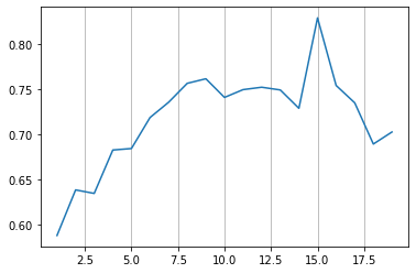
마지막으로 주 눈금, 보조 눈금에 관한 것이다.
grid를 both로 설정하면, x축, y축을 모두 그리며
하나만 설정해주면 해당 축의 눈금만 그려준다
plt.plot(one_to_nineteen, work_group_total['mean'])
plt.grid(axis="both");
plt.plot(one_to_nineteen, work_group_total['mean'])
plt.grid(axis="y")

plt.plot(one_to_nineteen, work_group_total['mean'])
plt.grid(axis="x")
그래프에는 major라는 주요 눈금
minor라는 보조 눈금이 존재한다.
이 minor라는 보조 눈금은 특정 설정이 없으면
작동이 되지 않는데 아래의 예시에서는 설정을 해줘도
오류는 나지 않고 아무런 grid 설정이 없게 나온다
plt.plot(one_to_nineteen, work_group_total['mean'])
plt.grid(axis="x", which='minor', color='r', linestyle='--')
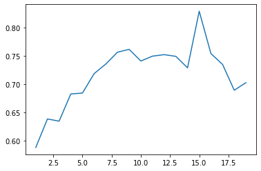
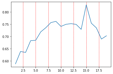
major는 아무런 설정 없이 바로 결과가 나오는 것을 확인 가능하다
plt.plot(one_to_nineteen, work_group_total['mean'])
plt.grid(axis="x", which='major', color='r', linestyle='--')
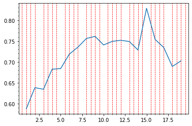
이러한 보조 눈금을 활성화 하려면
plt.minorticks_on() 라는 옵션으로
보조 눈금을 활성화 해줘야지 해당 결과가 출력된다.
아래의 결과는 주 눈금이 없는채로,
보조 눈금 0.5 간격만큼 빨간 선이 칠해진 그래프 이다.
plt.minorticks_on()

plt.plot(one_to_nineteen, work_group_total['mean'])
plt.grid(axis="x", which='minor', color='r', linestyle='--')